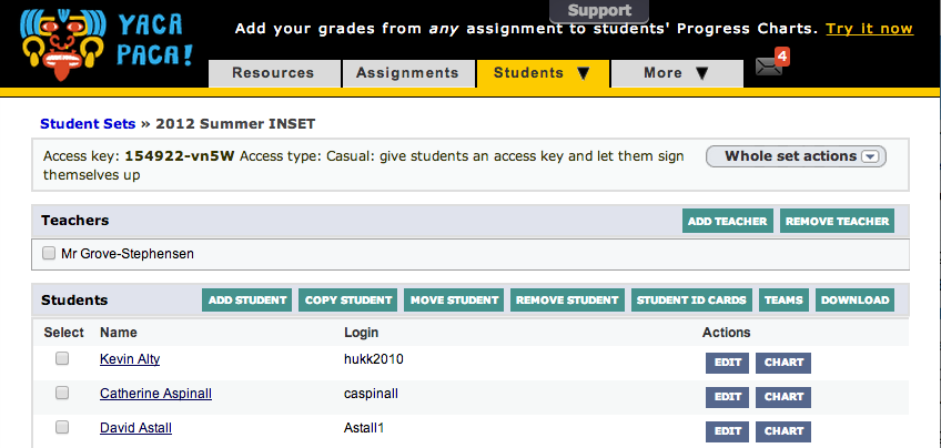
Over the last few months we have added a lot of features to the Student Set page. A lot.
Which is great, except that the page has been getting smothered in button. We replaced the top row of buttons a while back with a “Whole set actions” dropdown, but people were missing it against the rather shouty background of all the other buttons.
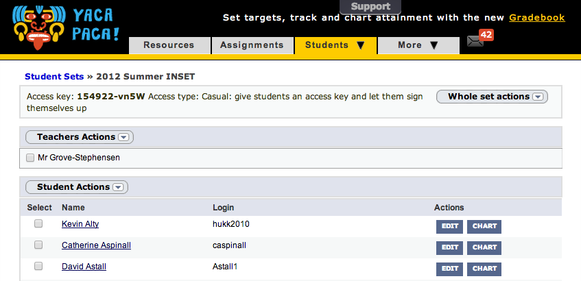
Here is our solution. Rather than making that button shout, we’ve replaced all the turquoise (technically “Level 2”) buttons with dropdowns. An added benefit is that we’ve been able to move the dropdowns to just above the checkboxes. Many of the actions, such as ‘move student’, work specifically on checked items. I think the new layout makes that a little more obvious.
The focus of all of our design changes at the moment is to reduce the cognitive load of the application. In other words, the design should get out of the way and let your brain put all its attention into doing the job you came to do.
So the greatest accolade for this particular update will be if nobody notices.

Leave a comment