|
Time progression
|
Block of time | Single assignment | |
|
Individual student
|
5. Evidence
6. Parent reports
|
Gradebook averages*
|
Gradebook* Activity log* Detail* |
|
Student Set
|
7. Progress chart
8. Progression with metadata
|
4. Progress in topics
2. Quiz analysis
|
1. Gap Analysis
2. Quiz analysis
3. Analysis whiteboard
|
9. Pivot Chart (beta) does not quite fit in this table.
*strictly speaking these are reportage pages, covered here.
1. Gap Analysis Popup
Under the Assignments tab, click on the name of any quiz to see a popup like this. It gives you an at-a-glance overview of what the students have and have not understood. You can see below this CPD group understood ‘motivation’ far better than the ‘Ebbinghaus’ (of forgetting curve fame). Its usefulness depends on how well the author tagged the questions in the first place.

Click the More Detailed Analysis button to see…
2. Quiz Analysis
This is a per-question breakdown of the students’ responses. By default, it shows just a single assignment, but note the filter buttons across the top; there is an enormous amount of power here for those minded to explore.
 Let me dig into a little bit more detail with an example. I am going to look at just one question, and view students’ responses to the pre-test and the post-test. Here are the pre-test responses:

Students answered the question literally, for the most part. However, after reading about John Hattie’s research, the majority developed a far more nuanced view.

To observe the change above, all I had to do was use the Attempts dropdown to select the first and second attempt respectively. This is just a tiny example of the power of the Quiz Analysis page; it really deserves a small textbook in its own right.
3. Analysis whiteboard
Where the previous page is designed purely for the teacher, the Whiteboard is a tool to share some of the same data with students via your data projector. As it is a dynamic, animated page, we need a screencast to present it. This was made before the last redesign, so it may look a little unfamiliar. The whiteboard itself has not changed at all.
My apologies that I cannot for the life of me remember who made this screencast, so I can’t credit him.
Reach the whiteboard via
Assignments tab -> Results -> Analysis Whiteboard
It’s written in Flash so will not run on your mobile device. Not that it is meant to; as the name implies, it is designed for projection.
4. Progress in Topics
If you are delivering a significant proportion of a syllabus through Yacapaca, whether as quizzes, Quick Assignments, Offline Assessments (i.e. only the mark is entered into the Gradebook) or a mixture of these, you will want to see how much the students have covered and understood. Enter Progress in Topics.
Find this under Students tab -> Student Sets -> Actions -> Progress in Topics
or
Gradebook -> Actions -> Progress in Topics

5. Evidence download
Teachers who are suffering under a requirement to produce reams of detailed evidence of progress can access the data directly as a set of .csv files to download into a spreadsheet. The table shows the date, the keyword, the question count for that keyword and the average percentage score achieved. The intention is that you can manipulate this data in your spreadsheet to produce the exact report demanded by your superiors. To access them
Gradebook -> Actions -> Evidence
Be patient, especially if there is a lot of data to download.

6. Parent reports/Progress charts for individual students
The first of our time-based analytics, this chart simply shows the average grade achieved by the student in each month. If you have set a target, it will also show the flightline the student needs to be on to hit that target.
The chart for each student is available as a popup on the Gradebook, under the Chart button. You can also download a complete set of PDF printable Parent Reports, that contain this chart along with a detailed list of assignments and grades, from
Gradebook -> Actions -> Parents’ Reports

7. Progress chart for a whole student set
This another whiteboard application, though the intended use-case is staff meetings more than in the classroom. It shows the trendline for each student, along with a class average. The screenshot below has the students’ names trimmed from it for privacy – they are listed on the left hand side.

What this shows is
- Yellow dots – this student’s individual assignment scores.
- Red line – the trendline for this student.
- Blue line – the trendline for the whole set.
- Grey line – a second selected student with whom this one is being compared. You can select as many or as few students as you want this way.
8. Progression Charts with metadata
View how different categories of student are performing month-by-month. How much you get out of this really depends on what you put in. Yacapaca performs gender analysis on students’ names automatically; all the other data must be uploaded by you. More on this here.
Access these charts via
More tab -> Progression Charts
or wait for them to arrive in your monthly email.

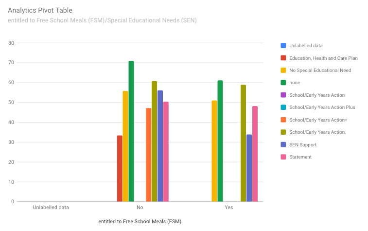
9. Pivot charts (beta)
You won’t find these in the interface; they are available to beta testers only request as they are still a bit buggy. Enter any two metadata categories, group of student sets and a date range. Get a cross-tabulated table and a chart to see how the intersected sets perform against each other.
To give you an example of what you can do with this, examine the green columns below. You can see that students with no SEN and no FSM outperform those with no SEN but with FSM. No surprise; it’s a sad reality that better-off kids do better at school. Now look at the pink columns for statemented SEN kids. The difference is far smaller! Why? Because statementing works, that’s why. Those kids are getting the individual support they need to largely overcome their economic disadvantage. Imagine placing that in front of Ofsted next time they turn up on short notice.

I don’t think any teacher uses the full set of these. Now you know they are there, I hope you will find and adopt just one that you had not previously considered.

Leave a comment